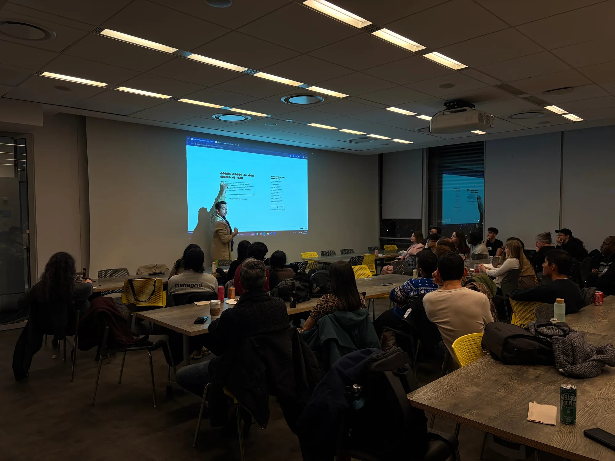
Overview
Gridless Design makes the case that the web supplies structure and order on its own, not through a fixed visual grid. It walks from the history of the grid through guidance for designers and concrete techniques for developers.
Problem
Grids have been a foundational design tool for decades, but the web is a different medium. Overlaying a curated grid onto the structure the browser already provides is often more trouble than it’s worth, fighting the platform instead of working with it. The harder part is that the grid is not just a technique, it is how most designers were trained to think.
Constraints
- Audience spans traditional designers and web engineers with different mental models
- Must teach a mindset shift, not just a technique
- Examples have to hold up across screen sizes and reader preferences
Approach
Rather than prescribe a grid, the site shows how the web supplies structure on its own: spacing that follows the content and the reader’s own text size, alignment the browser resolves rather than one drawn on top of it, and layouts whose columns are informed by what sits inside them. It moves designers away from designing for a set of fixed screen sizes and toward layouts that respond to their content and whatever space they are given.
Key Decisions
Teach implicit layout instead of imposing an explicit grid
| Reasoning | Alternatives |
|---|---|
| Letting content and the medium drive layout produces more resilient, accessible, preference-respecting results than a rigid grid. | Standard 12-column grid systems Framework-provided grid utilities |
Split the material into a designer track and a developer track
| Reasoning | Alternatives |
|---|---|
| Designers need the mindset shift while developers need the concrete techniques, so each track meets its reader where they are instead of asking one audience to sit through the other’s explanation. | One combined explanation for every reader |
Result & Impact
- Reach: Cited by Brad Frost, Christine Vallaure, and Figma’s design systems guide
Gridless Design gave the community a vocabulary and rationale for working with the grain of the web, and it continues to influence how teams think about responsive layout.
Learnings
- The reference resonated more than I expected: as responsive design became the standard, a rigid grid was just another rule stacked on the web’s own, and letting content flow was unfamiliar enough to traditional designers that the teaching was genuinely needed
- The web rewards working with the medium rather than porting print conventions onto it. Column counts and fixed gutters are habits from a fixed canvas; the browser already resolves alignment, wrapping, and available space, and designing with that removes friction that designing against it creates
- A clear, opinionated framing helps a mindset shift land. Naming the idea ‘gridless’ and stating the provocation plainly gave people a memorable handle for an unintuitive change, which carried it into talks, articles, and other teams’ guidance far better than a neutral how-to would have
The story behind it
Grids came to the web as an inheritance from print, where a fixed canvas makes a fixed grid sensible. The web has no fixed canvas. The screen, the reader’s font size, their zoom, and the content itself all vary, so a curated grid becomes one more rigid rule stacked on top of the rules already in force. “Blasphemy, I need structure and order!” is the honest reaction, and the site’s answer is that the web already supplies both, if you stop fighting it.
The hard part is rarely the technique, it is the mindset. Anyone trained on a static artboard has learned to place things at coordinates, so letting content simply flow, sizing itself to the space and the words inside it, can feel like giving up control. Gridless meets that discomfort directly: it traces where the grid came from, separates the path for designers from the path for developers, and shows that the order designers want is still there, just produced by the medium instead of drawn on top of it.
That unfamiliarity is exactly why the reference was needed, and why it resonated well beyond what I expected.
Read more at gridless.design.
All projects